Introduction
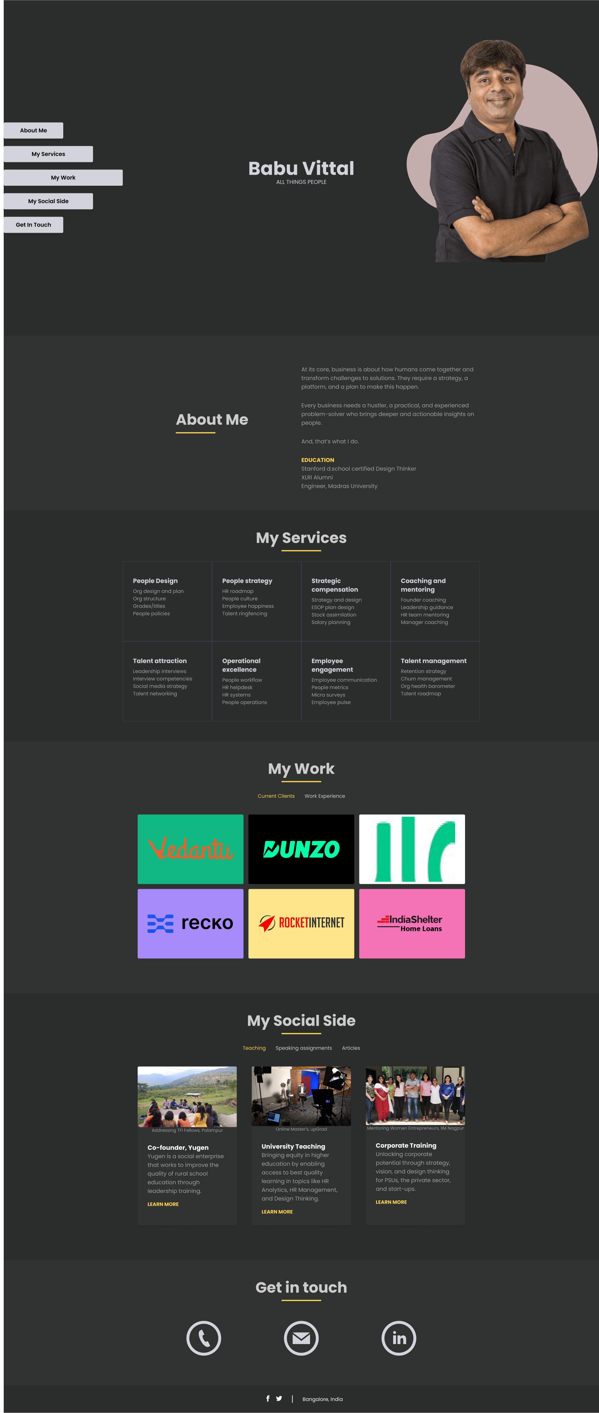
Babu Vittal wanted a simple website to showcase his work and experience, a link that he can share with a potential client.
Go to website
Design
I chose a dark color pallette and a contrasting yellow as a higlighting color. The layout was simple and navigation items held a higher priority on the landing page.


